Case study
Testing Earlier Cover Comparison to Improve Renewal Retention
Testing whether earlier cover visibility could help customers explore better-fitting options and complete their renewal.

Role
Product Designer
Team
Product Owner · Design Lead · Engineers · QA
Platform
Responsive Web
Duration
1 week design + 8 weeks experiment run
Focus
UX Design · Product Thinking · Experiment Design · A/B Testing
Outcome
Increased cover exploration, with a positive but inconclusive trend in renewal completion
01 - The Challenge
Renewal retention was declining.
Customers returning to renew their policy only saw their existing cover level. Alternative options were available, but they weren’t visible until later in the journey. If the renewal price felt too high, many customers left before realising there were other cover options that might better fit their needs.
Instead of redesigning the entire renewal experience, we asked one focused question:
Could surfacing alternative cover levels earlier help customers make more informed renewal decisions?
1
Customer returns
2
Sees renewal price
3
Alternative options hidden
4
Leaves journey
02 - Success Criteria
What we set out to learn
Improve renewal completion
Help more customers complete their renewal instead of abandoning the journey.
Increase cover exploration
Encourage customers to actively compare available cover levels.
Understand the trade-offs
Measure how greater customer choice influenced customer behaviour while understanding the broader business impact.
03 - Designing Within Constraints
The experiment needed to answer the business question without adding
unnecessary complexity.
Existing renewal platform
Fast to validate
Mobile-first experience
Complex pricing logic
04 - Exploring solutions
We explored whether showing alternative cover levels earlier could improve retention.
I explored different concepts across the copy, information hierarchy, and mobile card layout, balancing customer experience with engineering effort and the scope of the experiment. I then refined the direction with my Design Lead.
CONCEPT 01
Expand the dashboard

The first concept displayed every cover level inside the existing accordion.
Although it worked on desktop, the experience became increasingly cluttered on smaller screens. Customers had to scroll through multiple cover cards before reaching the rest of the renewal journey.
Learning: Earlier visibility shouldn't come at the cost of usability.
CONCEPT 02
Comparison modal
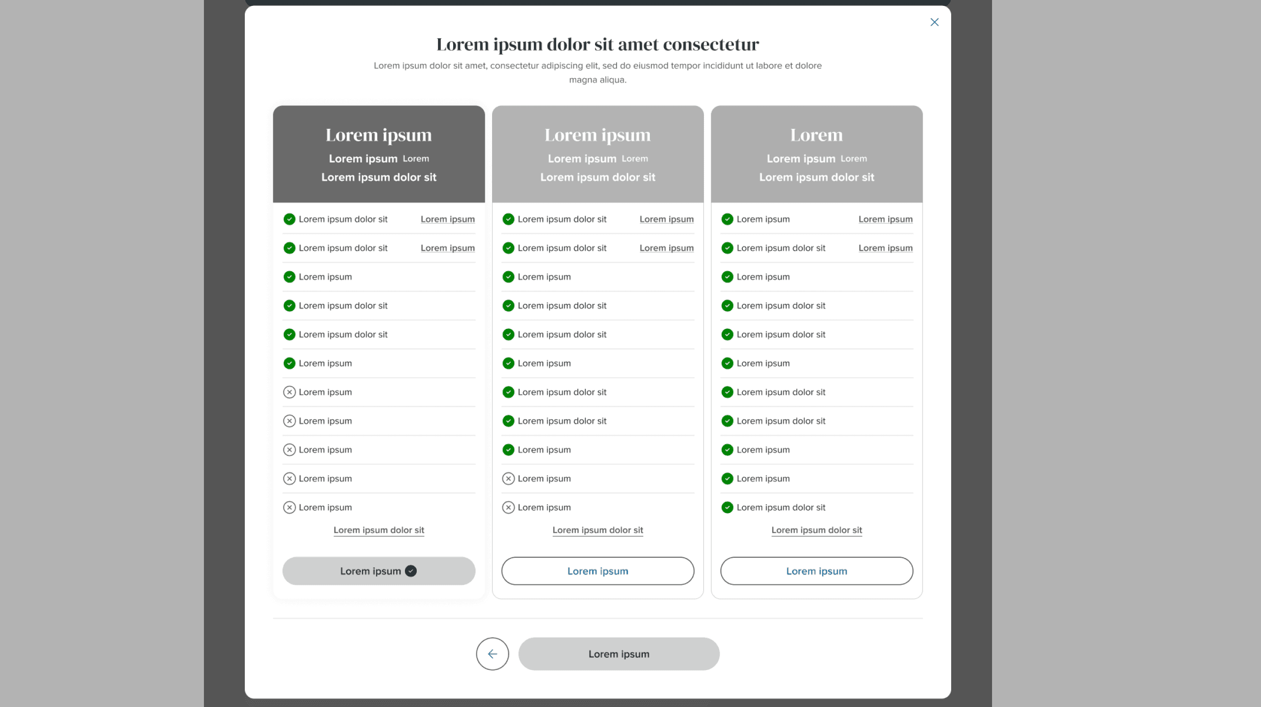
Moving comparison into a modal created a cleaner desktop experience, but on mobile it effectively became another page. Comparing multiple options required excessive scrolling and added unnecessary interaction complexity.
Learning: The goal wasn't a better comparison interface. It was helping customers recognise alternatives earlier.
FINAL DIRECTION
Surface it inline, reuse what exists

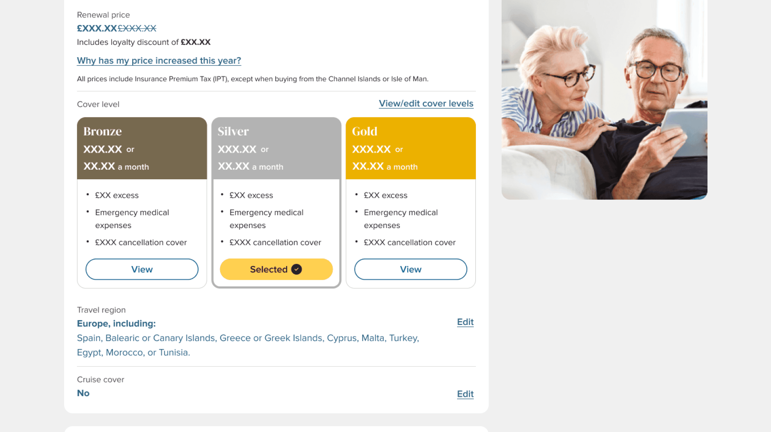
Instead of rebuilding comparison, I surfaced key information directly within the dashboard while reusing the existing comparison experience.
Specifically, this meant showing price and key benefit deltas for each cover level inline on the dashboard, rather than requiring an extra click - customers could recognise a better fit before ever opening the comparison flow, which we kept untouched to avoid new engineering scope.
The squad supported this approach because it balanced customer value with low engineering effort, making it the smallest experiment worth building.
05 - The Smallest Experiment Worth Building
Just enough information to help customers recognise that alternatives exist.

Before
The goal wasn't to redesign renewal. It was to test whether earlier visibility would change customer behaviour.
After
1
Current cover clearly identified.
2
Alternative cover levels visible immediately.
3
Shared benefits grouped to reduce repetition.
4
Existing comparison flow reused.
06 - Turning the Idea Into an Experiment
Rather than launching the feature permanently, we released it as an A/B experiment.
Control
Existing dashboard
VS
Variant
Dashboard with earlier cover visibility
Measure customer behaviour
HYPOTHESIS
If customers understand their available cover options earlier, they'll be more likely to explore alternatives and complete their renewal.
07 - RESULTS
The experiment increased cover exploration, but the impact on renewal completion was inconclusive.
Renewal completion increased
0.79%
0.92%
+16.2% relative increase
Renewal completion increased from 0.79% to 0.92%, a 16.2% relative increase. The result was not yet statistically significant, so we treated it as an early positive signal rather than a conclusive result.
Cover comparison engagement
6.2%
26.8%
+330% relative increase
Making alternative cover levels visible earlier increased the number of customers who explored their options before renewing.
More informed customer choices
Customers became more active in reviewing their options.
Both upgrades and downgrades increased, suggesting people evaluated different cover levels instead of renewing passively.
TRADE-OFF
Engagement rose sharply - but not all of it favoured upgrades. Downgrades grew faster than upgrades, and revenue per visitor dipped slightly. Transparency surfaced real customer intent, not always the intent the business hoped for. Rather than a design failure, this reframed the conversation around fit over short-term revenue.
08 - What I Learned
Designing experiments is different from designing features
Instead of building the perfect experience, we built the smallest solution capable of answering an important product question.
Constraints improve decisions
The strongest solution wasn't the most complex one.
It was the one that balanced customer value, engineering effort and learning.
Success isn't one metric
This project reinforced that product design isn't about maximising a single KPI.
It's about helping teams make better decisions by balancing customer outcomes with business goals.
09 - If We Continued This Experiment
Gather qualitative feedback from customers who changed cover levels.
Monitor longer-term renewal behaviour.
Explore whether similar patterns could improve other customer journeys.
Revisit richer interactions if future evidence justifies the investment.
This project started with a simple question:
Could earlier visibility help customers make better renewal decisions?
The experiment showed me that product design can help teams make better decisions, not just improve the interface.
It’s about reducing uncertainty, helping customers explore their options and generating evidence that guides better product decisions.